Your logo shifts from electric blue to a dull blue between the screen and the delivered card. This is not a manufacturing fault: it comes from moving between two colour models. Four-colour printing reproduces colour from four inks only, while your screen simulates millions.
What does that mean on a badge? When should you choose a Pantone spot colour instead? And why can a barcode printed in CMYK become unreadable at the till? This guide answers those questions, with the figures we apply to our custom ID cards and access badges.
Key points
→Four inks, every colour. Four-colour printing (CMYK) reproduces a full design from cyan, magenta, yellow and black.
→Five steps. Separation, plates or RIP, ink laydown, registration, screening and drying.
→Volume picks the process. Digital below 500 units, offset above 1,000, screen printing on rigid media.
→CMYK or Pantone. CMYK from three colours in the design. Pantone when the brand colour is critical.
→Barcodes. Single black, at least 30 % contrast, quiet zone preserved.
Four-colour printing, also called CMYK printing, reproduces every colour of a design from four base inks: cyan, magenta, yellow and black. The inks are laid down as microscopic dots that overlap and sit side by side. The eye recombines them at reading distance. It is the standard process for professional colour printing.
Definition: the four CMYK inks
CMYK stands for cyan, magenta, yellow and key. The key plate carries the black, the detail and the text.
CMYK printing works by subtractive synthesis. Each ink absorbs part of the light spectrum and reflects the rest. Stack the three chromatic inks at 100 % and you get a muddy brown, not a true black. Hence the fourth ink.
→Cyan: absorbs red, builds blues and greens.
→Magenta: absorbs green, builds reds and purples.
→Yellow: absorbs blue, builds oranges and greens.
→Black: deepens shadows and keeps text and barcodes sharp.
CMYK and RGB: what changes on the finished item
Criterion
RGB (screen)
CMYK (four-colour printing)
Principle
Additive: light adds up
Subtractive: ink absorbs
Components
Red, green, blue
Cyan, magenta, yellow, black
Medium
Backlit screen
Paper, PVC, synthetic film
Colour gamut
Wide, including fluorescents
About 70 % of the visible spectrum
Use
Web, video, presentations
Cards, badges, labels, brochures
According to Pixartprinting, four-colour printing reproduces roughly 70 % of the colours the human eye can see. The missing 30 % are exactly the shades that cause trouble: royal blues, emerald greens and fluorescent oranges.
Why printed colours look duller than on screen
Three causes add up, and none of them is a production defect.
→RGB to CMYK conversion. Any colour outside the CMYK gamut is pulled back to the nearest printable shade.
→No backlight. A screen emits light. A PVC card only reflects it, so perceived brightness drops.
→The substrate. Uncoated paper absorbs ink and desaturates. Laminated gloss PVC holds density.
The fix is a single habit: convert to CMYK before approval, and sign off on a physical proof rather than a screen. For strict brand colours, the deviation is measured under ISO 12647-2, the standard that governs offset process control and print run tolerances.
How does the four-colour process work?
The process runs in five steps: separating the file into four CMYK layers, making plates or running a digital RIP, laying down the inks, registering the four layers, then screening and drying. A fault at any single step shows on the entire run.
The five steps
→Separation. The file is split into four monochrome layers, one per ink. Colour conversion happens here.
→Plates or RIP. Offset engraves four plates. Digital sends the file to a RIP that drives the press directly, with no plate.
→Ink laydown. Most offset presses print black, cyan, magenta then yellow, to limit dot gain.
→Registration. The four layers must align within a hundredth of a millimetre. Misregistration blurs edges and creates colour halos on fine text.
→Screening and drying. Screening turns solids into variable-size dots. Drying by absorption, UV or LED fixes the ink before handling.
Offset or digital four-colour printing
Offset four-colour printing and digital four-colour printing deliver the same visual result. They differ on setup cost and break-even volume.
Criterion
Offset
Digital
Setup
Four plates, press make-ready
No plate, file straight to RIP
Fixed cost
High, spread over volume
Close to zero
Unit cost at high volume
Lowest available
Flat, barely decreases
Observed break-even
From 1,000 to 2,000 units
Below 500 units
Lead time
Longer, make-ready included
Short, no make-ready
Variable data
Not possible without overprinting
Native, unique number per item
Our 75/100th four-colour front PVC customised access badge shows the volume effect: €1.82 excl. VAT per unit at 200 pieces, €0.60 at 2,000 pieces. The unit cost drops threefold on the same reference, with no change to the file.
Screen printing: the rigid plastic case
On rigid, non-porous media a third technique applies. Screen printing pushes ink through a mesh, one colour at a time, and lays down a much thicker ink film than offset.
The result is dense solids, strong scratch resistance, and the ability to print opaque white or metallic ink that CMYK alone cannot produce. In exchange, fine gradients and photographs perform better in offset or digital.
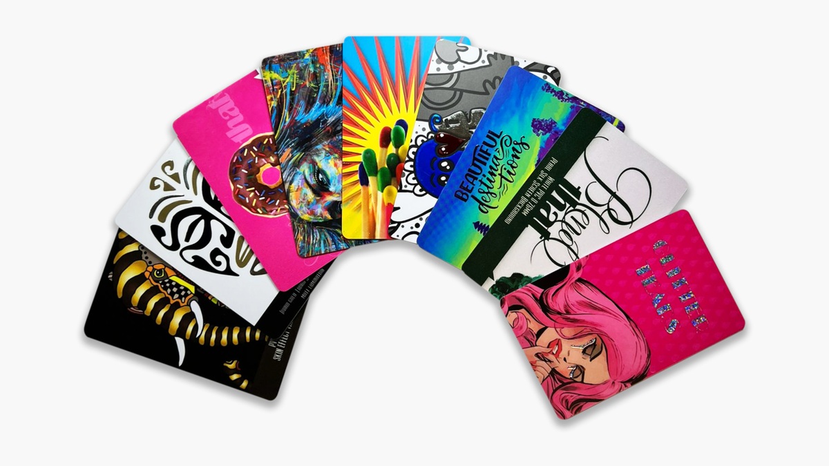
SBE note: our double-sided customised PVC card is printed in five colours, with a seven-colour option adding orange and violet to widen the gamut beyond standard CMYK.
Advantages and disadvantages of four-colour printing
Four-colour printing dominates colour work for good reasons. It also has clear limits, worth knowing before you approve a file.
Advantages
→Unlimited colours. Photographs, gradients and solids cost nothing extra per additional shade.
→Low setup cost. Four standard inks, no dedicated ink mixing.
→Available everywhere. Offset, digital and screen printing all accept CMYK.
→Strong at volume. Unit cost drops sharply from 1,000 pieces in offset.
→Variable data ready. In digital, every item carries its own number and barcode.
Disadvantages
→Limited gamut. About 70 % of visible colours. Fluorescents, metallics and highly saturated blues stay out of reach.
→Run-to-run drift. The shade is simulated, not pre-mixed, so it can vary from one order to the next.
→Registration dependent. A shift between the four layers blurs fine text and barcodes.
→Substrate sensitive. Uncoated paper desaturates. The same file looks different on another medium.
→Demanding file prep. CMYK conversion, 300 dpi, bleed and single black are mandatory.
In practice: four-colour printing suits almost every identification medium. A Pantone spot colour stays reserved for strict brand guidelines.
Four-colour printing or Pantone: how to decide
Choose between four-colour printing or Pantone according to how critical your brand colour is. CMYK simulates the shade with four inks and can drift between runs. A Pantone spot colour is pre-mixed and identical on every order. Beyond three colours in the design, CMYK becomes cheaper again.
The Pantone range holds 1,114 colours built from 13 base pigments. Fluorescents and metallics have no CMYK equivalent at all.
Four-colour printing on PVC cards, badges and labels
On identification media, four-colour printing is nearly always combined with a second technique. The colour background is printed in batches, and individual data is added afterwards in black. This two-stage logic applies to PVC cards, access badges and asset labels alike.
PVC cards: pre-printed CMYK or print on demand
→Pre-printed CMYK. The card background is produced in a batch. You personalise on site with a card printer. Better background quality, low unit cost from 500 pieces.
→Print on demand. You start from a blank PVC card and print everything in house. Maximum flexibility, no obsolete stock, weaker colour on solid areas.
Either way the format stays the same: 86 x 54.03 mm, 750 microns thick, compliant with ISO/IEC 7810.
Labels: CMYK plus black overprint, or all digital
The fixed colour background is printed in CMYK on thermal transfer label rolls. Serial numbers and barcodes are added as needed, using a label printer and a thermal transfer ribbon. Resin ribbon withstands up to 150 °C and repeated abrasion.
Barcodes and variable data: the rules
→Print the code in single black, never composite black. Composite black depends on registration. Any shift blurs the bars and lowers the grade measured under ISO/IEC 15416.
→Respect contrast. "A minimum of 30 % contrast is required to reach the minimum grade of 1.5; 50 % is recommended", states the GS1 2D Barcode Colour & Quality Guide, Release 1.0, GS1, February 2025.
→Avoid red, orange and yellow bars. Scanners read at 660 nanometres. Those shades reflect red light like a white background and the contrast disappears.
→Keep the quiet zone clear. No element of the CMYK background may encroach on the margin around the code.
→Generate variable data from software. Use label printing software such as BarTender, never manual entry.
The same principle drives our QR code labels and our security labels.
Durability
Medium / finish
Expected service life
Laminated PVC card
Protective layers on both sides bring total thickness to 750 microns and shield the print from daily handling.
Polyester label + resin ribbon
Outdoor use, solvent and temperature resistance.
Paper label + wax ribbon
Short-term logistics and shipping, a few months at most.
Gloss finish
Maximum density, but reflections under direct light.
Matt finish
Easier reading, essential when a barcode is scanned in bright light.
Getting four-colour printing right: file preparation and pitfalls
A print-ready file for four-colour printing follows six rules: CMYK mode, 300 dpi, 3 mm bleed, outlined text, single black for codes and fine type, and PDF/X export. One breach is enough to delay production and trigger a rejected proof.
→Convert to CMYK before export. Leaving conversion to the supplier means letting them choose your colours.
→Work at 300 dpi at final size. A 72 dpi web image enlarged on a card is unrecoverable.
→Allow 3 mm bleed. Trimming is never perfect; without bleed a white edge appears.
→Outline your text. A non-embedded font is silently substituted at preflight.
→Use 100 % single black for fine text and codes. Keep rich black for large solids.
→Export as PDF/X-1a or PDF/X-4. These profiles block unflattened transparency and leftover RGB images.
The five costliest mistakes, in order of frequency: a file left in RGB, low-resolution images, missing bleed, a barcode in composite black, and a brand colour approved on screen instead of on a physical proof.
Conclusion
Three decisions shape the project. The process follows the volume: digital below 500 units, offset above 1,000, screen printing when a rigid substrate needs a thick ink film. CMYK or Pantone follows how critical the brand colour is and how many shades the design carries. The substrate follows the expected service life.
One reflex stays constant: keep the barcode out of the colour debate. Single black, light background, quiet zone preserved.
Our teams issue an express quotation within 4 hours and supply free samples so you can check the result on the real substrate before launch. For a badge, an access card or a traceability label, that is the safest way to secure your four-colour printing project.
Updated September 2026.
FAQ
What are the most common CMYK printing problems?▾
Four issues recur constantly. The first is late RGB to CMYK conversion, which dulls saturated blues and greens. The second is misregistration: the four layers align poorly and edges blur, which penalises small text and barcodes above all. The third is dot gain, which darkens midtones on absorbent paper. The fourth is composite black used instead of single black, a direct cause of unreadable codes. The remedy is the same in every case: convert early, approve on a physical proof, and reserve 100 % K for fine elements.
Is it better to print in RGB or CMYK?▾
Always print in CMYK. RGB is a screen model built for a light source, and no press uses it directly. An RGB file sent to production is converted automatically by the supplier workflow, using a profile you did not choose, so the outcome escapes you. Converting to CMYK yourself shows which colours fall outside the gamut so you can correct them before approval. Keep RGB for digital media: website, email signature and presentations.
Is four-colour printing full colour?▾
Yes, four-colour printing is genuine full-colour printing. It reproduces photographs, gradients and solids with no limit on the number of shades in the design. Its limit is not the count of colours but their range: about 70 % of the visible spectrum, according to Pixartprinting. Fluorescents, metallics and some highly saturated blues stay out of reach and require a Pantone spot colour or a special ink. On our PVC cards, the seven-colour option adds orange and violet to widen that range.
What is the difference between CMYK and RGB?▾
CMYK and RGB differ on physical principle. RGB is additive: red, green and blue beams add together, and at full intensity they produce white. CMYK is subtractive: each ink absorbs part of the light and the substrate reflects the rest, with the sum of inks tending towards black. RGB offers a wider gamut suited to backlit screens. CMYK matches what a press can actually lay down on a substrate. A colour visible in RGB is therefore not always printable, while the reverse is almost always true.
Need to check the result before the run?
Express quotation within 4 hours and free samples on the real substrate.